VISUAL DESIGN & ART DIRECTION
Visual brand designer with over 20 years experience in creating new brands as well as managing and refreshing existing ones

Visual brand designer with over 20 years experience in creating new brands as well as managing and refreshing existing ones
UBS Optimus Foundation is the charity arm of the Swiss Bank, which helps children around the world in 3 key areas: education, healthcare and child protection. Stories of Hope was a pitch-winning idea for their fundraising collateral for 2013-14.
We wanted to make the child the focus of all the communication because their stories will touch donors. They give a human face to problems encountered by children around the world. A five-week photoshoot to eight locations in 4 countries, the Philippines, China, South Africa and Peru to film and photograph these children and record their Stories of Hope, these videos were used on a microsite and a promotional video was made to help tell the story of the Optimus Foundation.
Donations increased by 50% for the year.
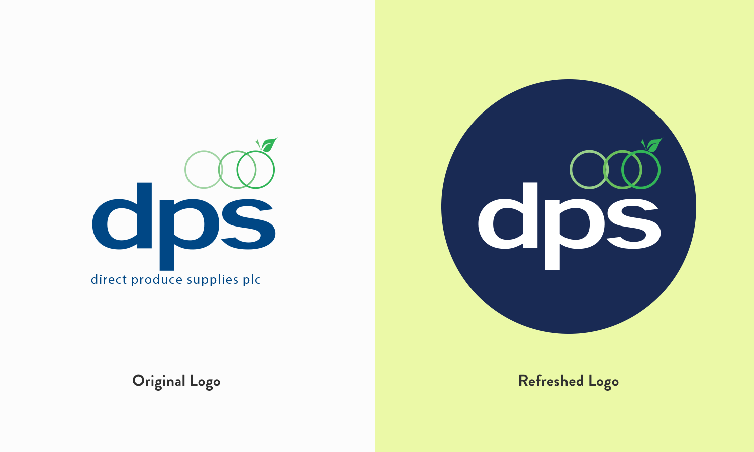
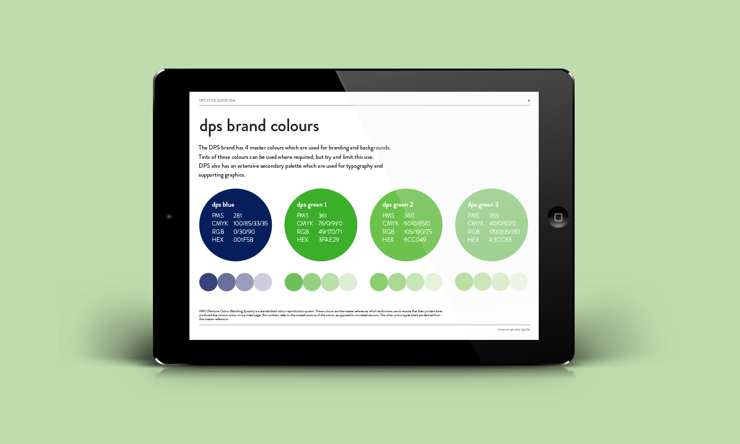
DPS is the largest importer of soft and stoned fruit in the UK. They wanted a brand redesign and a new website to give them – like the fruit they import – a fresh new look and feel. Their only red line was that they wanted their logo and colour palette to stay the same.
How do you rebrand a company who don’t want you to touch their logo? It was challenging, but I did it by using striking pictures of their fruit and suppliers alongside strong blocks of colour from their palette.
A London-based market research company wanted their brand refreshed to give them a more professional and modern look. They are passionate about market research and delivering data-driven insights into their clients’ customer bases to help them become more competitive.
The brand was rolled out over all touch points – from stationery, presentation document, a responsive microsite – and all of this was distilled into a set of brand guidelines for the London-based company to use.
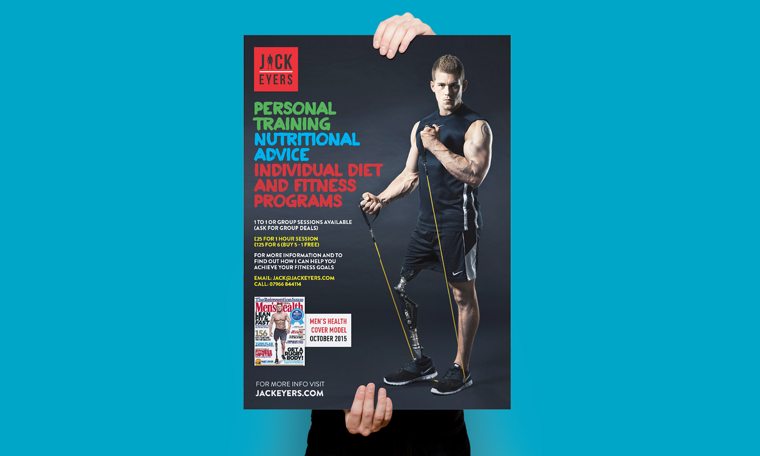
Bournemouth-based personal trainer Jack Eyers stands out when you meet him and he wanted a brand that would do the same. A simple silhouette of Jack and his most noticeable feature substitutes the A in this strong clean black and red logo.
Fish Supper 2016 is a fundraising weekend in October calling on all home cooks to host a fish-themed evening for friends and family. While last year’s campaign image focused on an empty white plate, this year’s idea was to create a campaign around real rescue stories and to have these illustrated on the plates.
The woodcut style illustration on a white plate, set against a distressed white wooden surface helped to create a lighter, fresher look and feel. Limiting the colour palette to just orange and black gave the campaign material a distinctive and contemporary brand that would sit across everything from advertising collateral, a microsite, fundraising packs, recipe cards and social media.
The key message booklets are a vital piece of kit for RNLI volunteers. These handy A5 tabbed wiro-bound booklets cover key safety messages to help people stay safe on the water – whatever activity they’re taking part in. I used a spread per activity with quick, easy-to-read stats in an infographic style on one side and more in-depth information on the other.
Two versions were created: one for when volunteers are talking to adults and one for when they are talking to under-18s.
I was asked by Balmaha Brewing Co. to design the packaging for Tartan Thistle Ales’ launch in North America. I created a label solution that plays on the brewery’s Scottish heritage. I designed a Balmaha tartan with a subtle colour change for each of the three different beers. I carried these contrasting modern colours through to the thistle motif and the bottle caps.
Coffee Conscience are a company selling coffee within the colleges and universities of Scotland. For every cup purchased, a percentage of profits go back to local environmental community projects. They wanted a brand that would reflect their efforts and would give them stand out. The angel cup makes the centrepiece of the mark and I used a striking colour palette.
Over my 10 years+ at Ogilvy, I was Castle Cements’ brand guardian, moving the brand to become the second largest cement company in the UK. I refined the logo to be a strong red castle icon to make them stand out in a highly competitive market.
I worked on all aspects of their business, designing their brand guidelines, cement packaging for both trade and DIY markets, literature style and livery of their cement trucks.
With over 50 years of history, this producer of navigational equipment for boats wanted to refresh their brand and set some rules of how they are seen in the market. Playing on their rich history, the first part of this brand guidelines document sets who they are and what they stand for, and it explores their heritage and landmarks.
The second part is the nuts and bolts: a technical guide to show the elements needed to create any piece of B&G content.
Our brief was to create a device/unit to engage with visitors to the lifeboat stations, museums and shops – and capture their email addresses to send them relevant news about the charity.
We created a display with an interactive app that encourages parents and children to pose and put their faces onto RNLI lifeboat crews, lifeguards or Storm Force characters. They then receive a digital postcard from their experience to share on social media. The unit, which was put in to 30 locations around the country, used a touch screen display with easy-to-follow instructions. The whole family could get involved.
In the first 3 months, the units had 10,522 interactions and collected 3,026 email addresses.
Cobham Update magazine is the internal quarterly publication to keep the staff of this global technology and service innovator updated with company news.
A new mast head, font and design system was implemented, keeping the spreads to minimal copy and large full-bleed imagery for maximum visual impact.
PUMP UP THE VOLUME was a monthly club night that played ‘90s hip hop, house and pop.
I produced the eye-catching posters, flyers and emails for this very successful night. I used fluro colours matched with iconic artist photography to create a unique look and feel for the night. PUMP UP THE VOLUME was named in Time Out’s Best of the Year as the runaway success of 2010.
These are concept designs for a range of fruit ciders the Balmaha Brewing Co. were bringing to market. Simple, modern, flat colour illustrations of the main flavour take prominence on these simple, uncluttered labels. The main colour of the flavour and illustration is carried through to the type and bottle caps.
I also designed a fruit wallpaper pattern for the reverse of the label.